Sign Systems That Work: Connecting Exterior, Interior, and ADA Signs Seamlessly
The customer arrives.
It starts in the parking lot. Maybe they’ve driven past your building a few times. Maybe they searched for you online, mapped the route, and found their way there with purpose. Either way, as they step onto your property, one question rises to the top: Where do I go next?
If your signage system is working properly, they won’t have to ask.
The best signage systems don’t shout. They don’t overwhelm. Instead, they quietly guide. They reassure. They set expectations and reinforce identity—without the customer even realizing they’re being led.
This is the difference between isolated signs and a sign design system: one is a collection of parts. The other is an experience.
The First Touchpoint: Exterior Signage
From the moment a customer sees your building, signage begins doing its job. Your exterior sign isn’t just a label—it’s a visual handshake. It introduces your business, sets the tone, and affirms that they’ve arrived.
But too often, businesses focus all their energy on the outside—and forget what happens next.
If the visual tone and design elements of your exterior sign aren’t carried inside, your customer experiences a disjointed narrative. A sleek, backlit metal sign out front followed by flimsy directional arrows on paper tacked to the wall? It’s a disconnect.
Consistency starts here. A professional sign company understands how to match materials, colors, and brand elements across spaces so that exterior signage smoothly transitions into the rest of the environment.
Through the Doors: Interior and Directional Signs
Once inside, customers look for cues—instinctively and immediately. Where is reception? Where are the restrooms? Which door leads to the conference room? At every point of uncertainty, signage steps in to answer.
Good interior signs do more than label. They orient.
For example:
- Wall-mounted directories should match the typography and visual cues of exterior signs.
- Hallway markers should echo the brand’s tone, whether formal, modern, playful, or minimal.
- Temporary messages (like event signs or room schedules) should use materials and design language that don’t feel like placeholders.
In short, everything speaks the same visual language.
This cohesion isn’t accidental—it’s the result of intentional sign design, where all components are created as parts of a larger ecosystem.
Seamlessly Integrated ADA Signs
Now imagine the customer needs to find a restroom—or a conference room, or an exit. They glance at the wall for assistance. That’s where ADA signs come in.
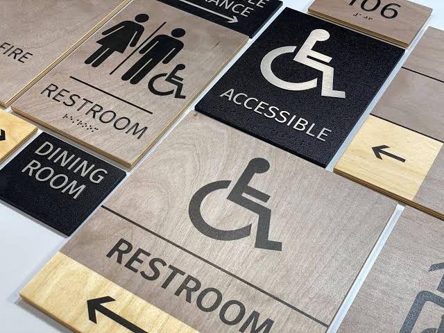
Often overlooked or treated as “just compliance,” ADA signage plays a crucial role in a holistic sign system. When done right, these signs aren’t afterthoughts. They’re integrated into the environment—both legally and stylistically.
To do that, they must:
- Follow ADA requirements for tactile lettering, contrast, and braille
- Be installed at the proper height and location
- Maintain visual consistency with other signage in terms of materials, color palette, and layout
When ADA signage breaks from the visual system—or feels like an add-on—it stands out for the wrong reasons. But when it’s woven into the broader sign design concept, it sends a more inclusive, professional message.
Signage as Spatial Memory
Now let’s return to the customer. They’ve checked in, navigated the space, and completed their visit. Maybe they made a purchase. Maybe they signed a contract. Maybe they simply walked away with a positive impression.
But what they remember visually—your nameplate, your directory, the arrows that pointed the way—are part of a larger subconscious memory.
When your signage is unified, purposeful, and well-placed, it reinforces your brand in subtle but powerful ways. This memory translates into:
- Greater trust in your services
- A sense of reliability and professionalism
- Easier orientation on return visits
- Positive reviews and word-of-mouth
This is what a strong signage system does. It turns individual signs into part of a fluid brand experience.
What Happens When Signage Isn’t Unified?
Unfortunately, many businesses build their signage piece by piece—often in response to needs, rather than as part of a strategy. Over time, this creates a patchwork of styles, colors, and functions that may solve isolated problems but fail to communicate a cohesive story.
Warning signs of a fragmented signage system:
- Inconsistent fonts or visual hierarchy
- Mismatched materials between interior and exterior
- ADA signs that don’t blend with the environment
- Directional signage that competes for attention instead of guiding clearly
This kind of visual fragmentation doesn’t just affect aesthetics—it affects usability, navigation, and perception.
Designing Systems, Not Just Signs
A comprehensive signage strategy involves more than just designing attractive plaques or lightboxes. It involves:
- Mapping customer movement from entrance to exit
- Identifying key decision points in navigation
- Understanding compliance requirements (e.g., ADA signs)
- Coordinating materials, textures, colors, and lighting across all spaces
- Planning for growth, updates, or future expansion
That’s where a skilled sign company becomes more than a vendor. They become a visual strategist.
Professionals like DesignElement Raleigh help ensure that every element—whether it’s on a glass door, a brick wall, or a brushed metal panel—supports the same narrative and functional goals.
Final Thoughts: From Signage to System
If signs are your brand’s voice, then your sign system is the full conversation. It’s the tone, the flow, the pauses, and the clarity that keeps people engaged—and coming back.
When you treat signage as a one-off task, you get a mix of mismatched visuals that work independently but fail together.
When you design a signage system, you get a seamless, supportive environment where every sign adds value.
Your customer might not notice every piece of it. But they’ll remember how easy it was to find the right door. How confident they felt. How the whole place just made sense.
And that’s the quiet power of signage done right.